## Restructured Docs, llms.txt, and Markdown
We've reorganized the docs and added support for LLMs and markdown.
### Docs
The docs are now split into four sections: **Concepts**, **Guides**, **Examples**, and **Reference**. Old URLs redirect automatically.
### llms.txt
We've added [`/llms.txt`](/llms.txt) and [`/llms-full.txt`](/llms-full.txt) endpoints for LLMs and AI tools. Every docs page is also available as markdown by appending `.md` to the URL. You'll find a "View as Markdown" link in the sidebar on each page.
## v1.1.0
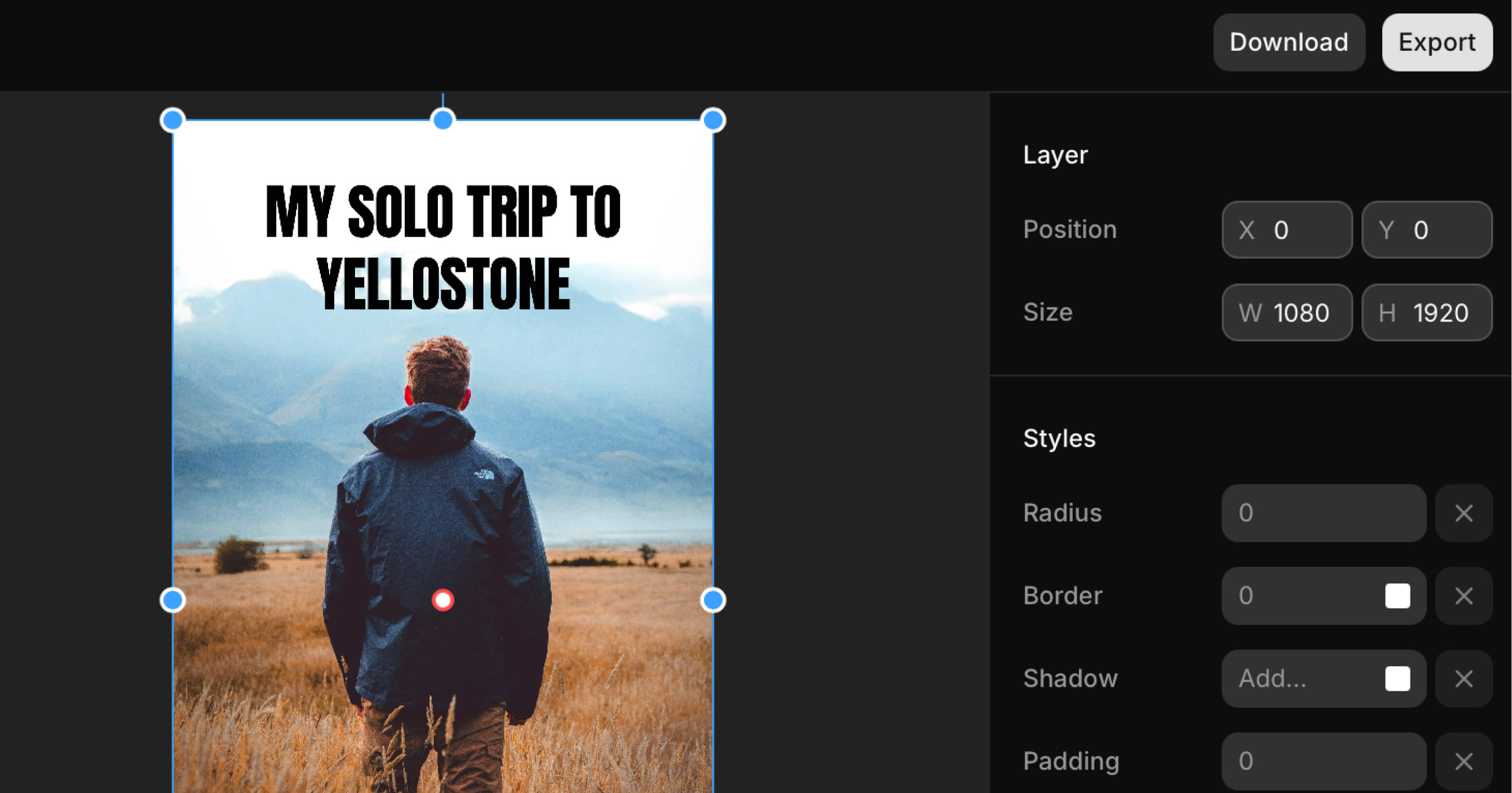
We just tagged `@shadcn/designer` v1.1.0 with a new unit system and unified Designer Tool API for managing canvas tools.
- [Unit System](#unit-system)
- [Designer Tool](#designer-tool)
- [Input Scrubber](#input-scrubber)
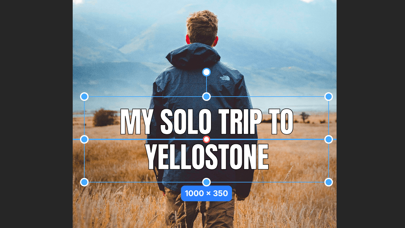
### Unit System
We now let you work in pixels, millimeters, inches, centimeters, or points with DPI-aware conversions.
- Introduced hooks for reacting to unit changes: `useUnitSystem`, `useSetUnitSystem`, `useDPI`, and `useSetDPI`.
- Added `ActionUnitSelector` for swapping units directly from the toolbar.
- Added a shared `units` library with helpers like `toPixels`, `fromPixels`, `parseValueWithUnit`, and `formatValue` plus `DEFAULT_DPI` and `DPI_PRESETS` presets.
- Updated editor defaults to store `unitSystem` and `dpi`, convert paper sizes from millimeters, and clamp dimension inputs at `0`.
- Refined dimension displays to show converted values with trimmed decimals and localized unit abbreviations.
```tsx
import { useUnitSystem, useSetUnitSystem } from "@shadcn/designer"
function UnitSwitcher() {
const unitSystem = useUnitSystem()
const setUnitSystem = useSetUnitSystem()
return (
Units: {unitSystem}
)
}
```
### Example
This example demonstrates how to use the unit system to display and work with measurements in different units.
### Designer Tool
We've introduced a new tool selection system that allows you to switch between different interaction modes on the canvas. This release includes two core tools:
- **Move Tool (V)** - The default tool for selecting, moving, resizing, and rotating layers
- **Hand Tool (H)** - Pan around the canvas without selecting or moving layers
#### Hooks
**`useDesignerTool()`** - Get the currently active tool
```tsx
import { useDesignerTool } from "@shadcn/designer"
function ToolIndicator() {
const tool = useDesignerTool()
return (
Active: {tool === "move" ? "Move Tool" : "Hand Tool"}
)
}
```
**`useSetDesignerTool()`** - Change the active tool programmatically
```tsx
import { useSetDesignerTool } from "@shadcn/designer"
function ToolSwitcher() {
const setTool = useSetDesignerTool()
return (
)
}
```
#### ActionToolbarTool
Dropdown toolbar button for switching between tools
```tsx
import { ActionToolbarTool } from "@shadcn/designer"
```
See the [Hooks Reference](/docs/reference/hooks#usedesignertool) for complete API documentation.
#### Example
Use the Cursor and Hand buttons in the toolbar to switch between the move and hand tools.
### Input Scrubber
The [`InputGroup`](/docs/reference/ui#inputgroup) component now supports scrubbing for faster adjustments without losing precision.
- Hold the mouse button and drag to scrub an input value.
- Added a `useScrubber` hook that handles pointer locking, acceleration, and modifier shortcuts for fine or coarse adjustments.
- Exposed the hook through the designer entry point so custom controls can share the same interaction model as built-in actions.
- Bundled a visual scrubber cursor that renders while dragging to make state changes easier to track.
```tsx
import * as React from "react"
import { useScrubber } from "@shadcn/designer"
function DimensionScrubber() {
const { scrubProps, value } = useScrubber({
value: 120,
onChange: (next) => console.log("Width", next),
})
return (
)
}
```
#### Continuous Button Press
We've added hold-to-repeat controls to make numeric inputs feel more responsive.
- Added a continuous press controller that emits repeated `onChange` events while increment or decrement buttons remain pressed.
- Integrated the behavior into `InputNumber`, matching keyboard repeat cadence and respecting min/max constraints.
- Tuned acceleration so long presses ramp quickly without overshooting small adjustments.
## v1.0.0
We're excited to announce the release of `@shadcn/designer` v1.0.0 (stable). If you do not have a license, you can get one [here](/docs/pricing).
Here's a list of the new features and improvements:
- **mode** - new `mode` prop to the `` component to switch between different layer modes. See the [docs](/docs/reference/designer#mode) for more information.
- **onMount** - We've added a new `onMount` prop to the `` component to run a callback when the designer is mounted. Useful for doing additional setup when the designer is ready.
- **defaultLayers** - the `layers` prop has been renamed to `defaultLayers` for uncontrolled components.
- **layers** and **onLayersChange** - We've added new props for controlled `` components.
- We've also introduced a layer signature optimization to reduce the number of re-renders.
- We've improved layer snapping to be more accurate.
See the [roadmap](/docs/roadmap) for what's coming next.
**Thank you to all the early adopters who have been using the designer and providing feedback: Mikkel, Sebastian, Piotr, Santosh, Jenny, Alex, Maria, David K., David E., and Sarah.**
## v0.4.0
We've released a new version of `@shadcn/designer` with several improvements to the image browser, a new image cropper and layer locking.
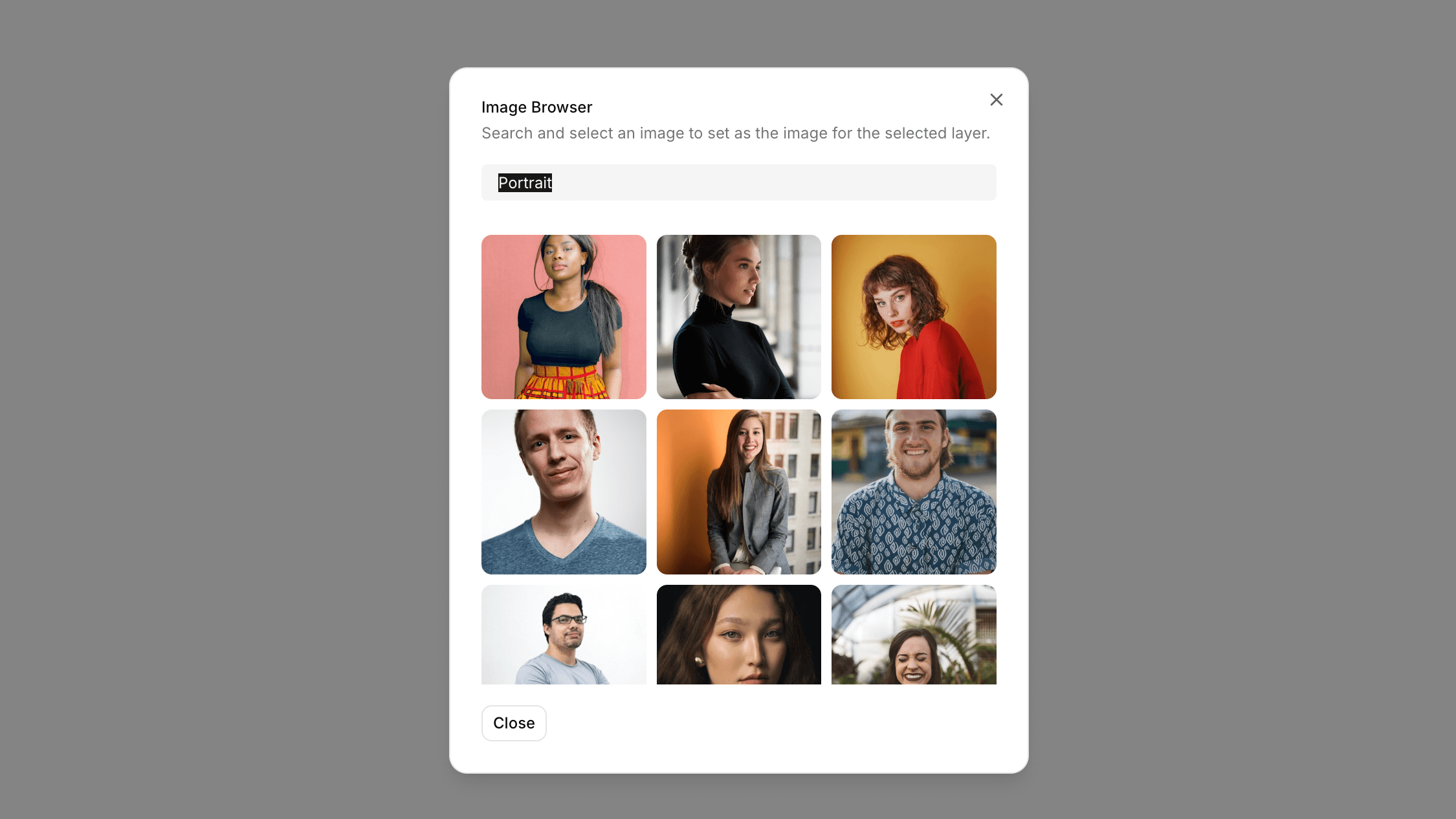
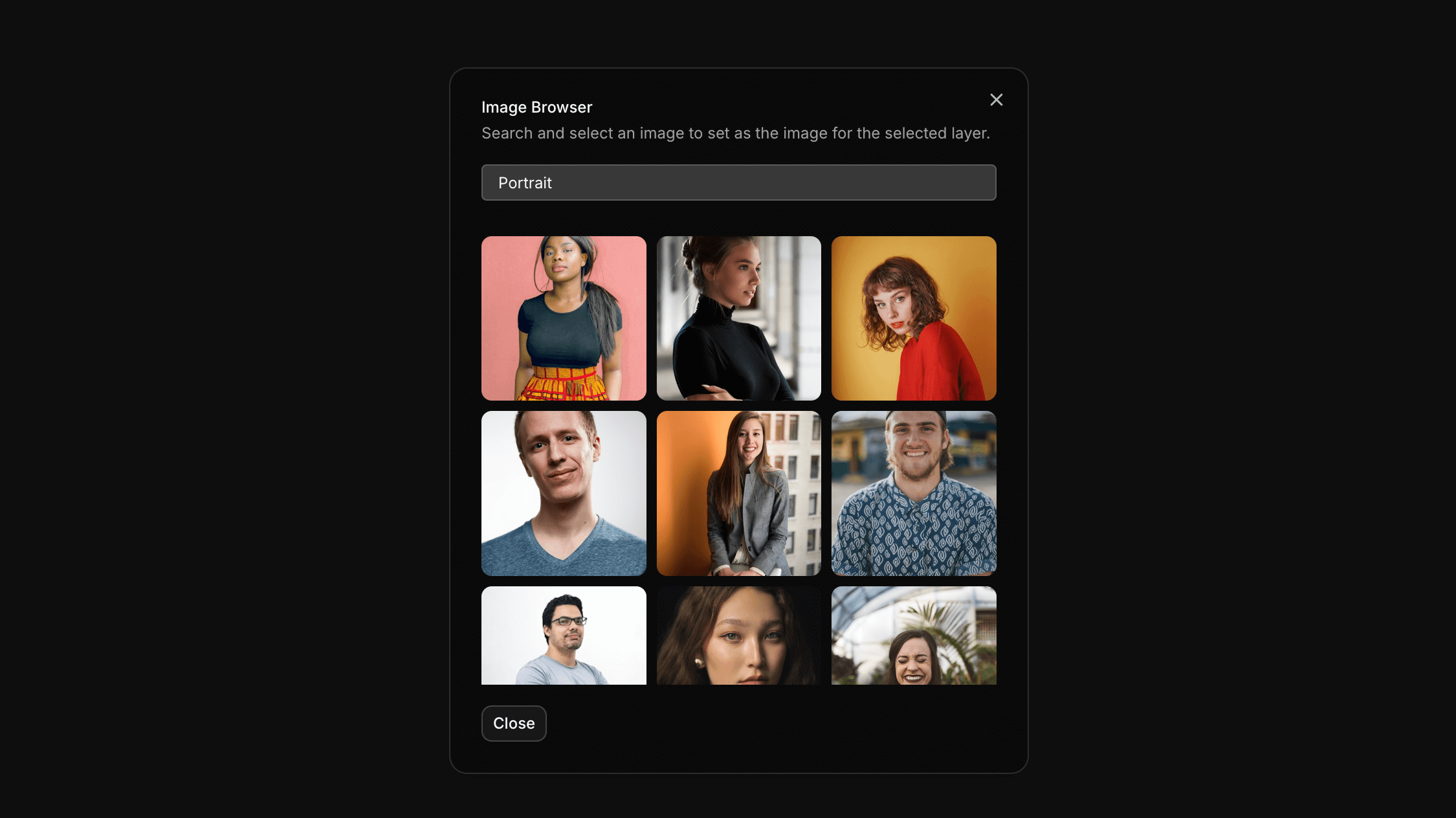
### Image Browser
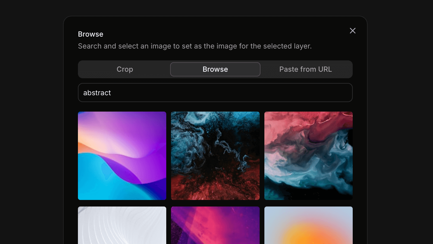
The new `ActionImage` now has support for plugins. You can build your own image plugin and use it in the image browser.
```tsx
,
},
{
id: "browser",
label: "Browse",
description:
"Search and select an image to set as the image for the selected layer.",
component: (
),
},
]}
/>
```
See the [Image Browser](/docs/guides/image-browser) guide to learn how to build your own image browser plugin.
### Image Cropper
We've added a new `ActionImageCropper` component for image cropping.
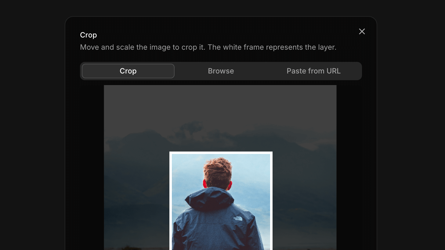
The `ActionImageCropper` can be used on its own or as a plugin for the `ActionImage` component.
### Locked Layers
We've also added a new `locked` property to layers. This allows you to lock a layer in place.
You can use the `layersAction("LOCK_UNLOCK_LAYER", [layer.id])` action to lock and unlock layers.
```tsx
import { useLayersAction } from "@shadcn/designer"
export function LockLayerButton({ layer }: { layer: DesignerLayer }) {
const layersAction = useLayersAction()
return (
)
}
```
## v0.3.0
We've released a new version of `@shadcn/designer` with several improvements to the core functionality and user experience.
### History API
We've implemented a new History API that allows you to undo and redo changes in your designs. The API is available through three new hooks:
```tsx
// Get access to the history state
const history = useHistory()
// Undo the last change
const undo = useUndo()
// Redo the last undone change
const redo = useRedo()
```
### Improvements
We've made several improvements to the canvas interaction:
- Added support for wheel and pinch zoom gestures
- Fixed adaptive zoom behavior for better viewport handling
- Resolved keyboard shortcut issues related to zoom controls
- Fixed layer update flickering issues for smoother rendering
### What's Next?
We are building more examples and documentation to help you, including image generation with AI. Stay tuned!
## v0.2.0
We just tagged a new release of `@shadcn/designer`. This release brings a lot of new features and improvements.
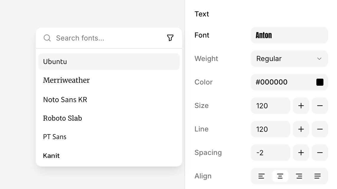
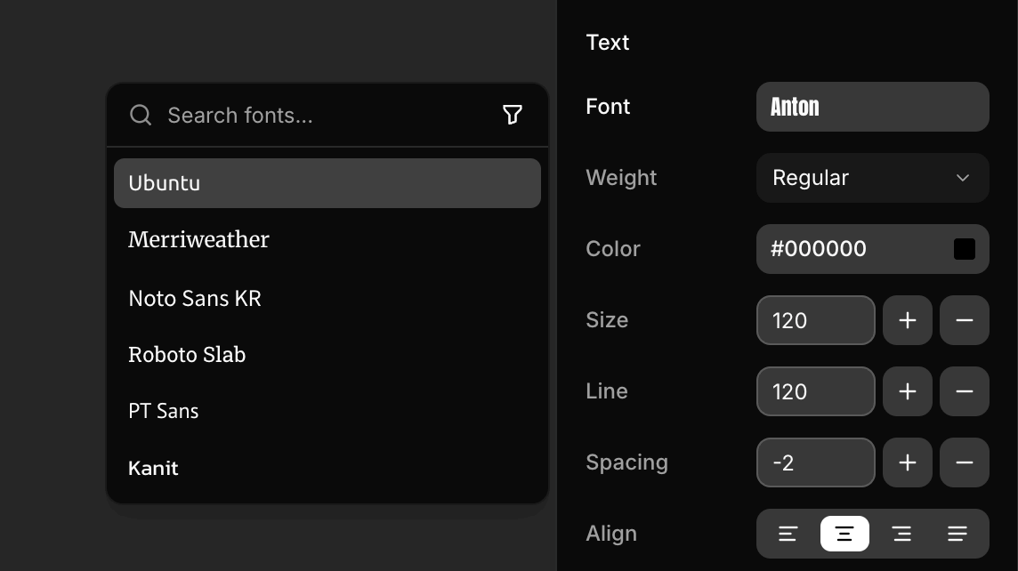
### Font Picker
We've added a Google Font picker to the designer.
The picker is decoupled from the designer so that you're free to implement your own picker or use the one we provide.
### Image Browser
We've also added an image browser using the Unsplash API. Use this as a reference to build your own image picker.
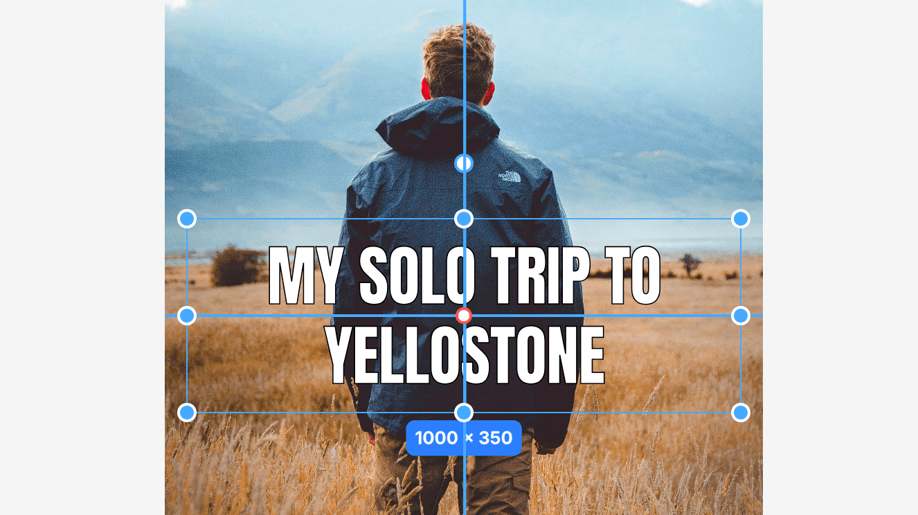
### Snapping
We've added snapping to the canvas. This means that layers will snap to the nearest grid point when you move them. This makes it easier to align layers to the canvas. We've also added distance guidelines for horizontal and vertical snapping.
### Template Updates
- We've updated the template to use the new font picker and image browser.
- We added examples for fetching fonts and images from the Unsplash API.
- The template now ships with a _Playground_ to test image layers. This is the same playground that you see in the demo.
- We also added an _Inspector_ to test the static frame rendering. This is useful for turning posts into images.
That's it for now. Grab the [latest template](/docs#download-template) to see the new features. See the [Roadmap](/docs/roadmap) for what's coming next.
## v0.1.0
We are excited to bring you this update as we are getting close to General Availability (GA).
This update brings a lot of changes to the core system. We've added a new set of hooks and components to make it easier to extend and build custom designers.
There are still a few things we're wrapping up, but we're excited to finally show you a demo of what we've been working on.
### Designer Demo
First, let's take a look at a demo of what we've been working on. Click on Launch Demo in the header to create your own personalized playground to test the editor.
Use this playground to test the editor features, layers, controls and actions.
### API
We've also built a demo to show how you can turn any design into an API. Using the API turns your designs into templates that can be used to generate designs for different contexts by passing in different layer values.
[Try the API](https://ds.shadcn.com/demo/dito/j73pj2qqr6nwdrs7/api)
### Export to Image
When you're done customizing your layer values, click the Download button to download the design as an image.
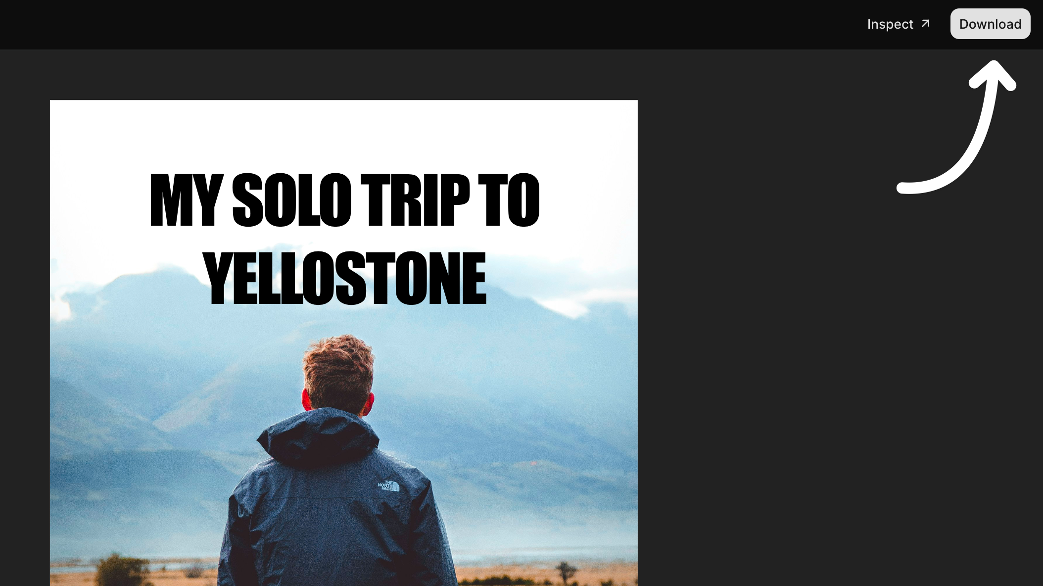
This can be used to generate images for social media, banners, etc and serve them on demand over a CDN.
### Performance Improvements
We've made a lot of performance improvements.
We reworked the internal system to have better rendering performance. Updates are granular and only trigger when necessary. We also fixed an issue with dropped frames.
### Layer Types
You can now define your own layer types and override the default ones. A layer type can bring in its own keybindings, default values and render method.
```tsx
(
// ...
),
}
]} />
```
### Hooks
Every state and action are now available as hooks. We provide all the necessary hooks to read and update the state of the designer.
```tsx
// Get the layers.
const layers = useLayers()
// Set the zoom level
const designerAction = useDesignerAction()
designerAction("ZOOM_IN")
// Get the selected layers
const selectedLayers = useSelectedLayers()
// Change the name of a layers
const setLayersProperty = useSetLayersProperty()
setLayersProperty([ID_OF_LAYERS], "name", "New Name")
```
See the [reference](/docs/reference/hooks) for more information on available hooks.
### Frame Size
We've made the frame size customizable. You can now pass a `frameSize` prop to the `` component to set the size of the frame. Useful for building social media images, banners, etc of different sizes.
```tsx
```
To programmatically change the frame size, you can use the `setFrameSize` hook.
```tsx
const setFrameSize = useSetFrameSize()
setFrameSize({ width: 1024, height: 1920 })
```
### Keyboard Shortcuts
We've added a new `keybindings` prop to the `` component to handle keyboard shortcuts. You can pass a `keybindings` object to the component to provide your own keybindings or override the default ones.
```tsx
```
See the [reference](/docs/reference/keybindings) for more information on available keybindings.
### Debug Mode
We've also added a new `debug` prop to the `` component to enable debug mode during development.
Previous Releases
## v0.0.1
See the [latest documentation](/docs) for the most up-to-date information.
Based on your valuable feedback, we've completely rebuilt [Designer](https://ds.shadcn.com) from the ground up. We would like to share an early preview that introduces a new level of composability and flexibility.
We've redesigned the system to be highly composable while preserving flexibility. This means you can build a simple component designer to a full-fledged designer with drag-and-drop functionality.
We're working on more documentation and examples, but we want to share an early preview with you. You can install and try it today.
Let's get started.
### Project Setup
We've put together a template to get you started. The template is a simple Vite app with Tailwind CSS, shadcn/ui and Designer.
Download the template and extract it into your project folder.
```bash
cd studio && pnpm install
```
```bash
pnpm dev
```
If you visit [http://localhost:5173](http://localhost:5173), you should see a white page displaying "Hello World".

### Setup the Designer
We'll start by adding the `` and `` components to our page.
Place the `` and `` components in the `src/App.tsx` file.
This will setup the designer and an infinite canvas with zoom, pan and controls.
```tsx
import { Designer, DesignerCanvas } from "@shadcn/designer"
export default function App() {
return (
)
}
```
Every design starts with a frame. The frame is the container that holds your layers.
A frame has a width and height. Use a `` component to set the size of your design. This can be any size you want eg. 1024x1024, 1920x1080, 2048x2048, etc.
Place the `` component inside the `` component.
```tsx
import {
Designer,
DesignerCanvas,
DesignerFrame,
} from "@shadcn/designer"
export default function App() {
return (
)
}
```
### Add a Layer
Now that we have the basic setup, let's add a layer.
```tsx
import {
Designer,
DesignerCanvas,
DesignerFrame,
type DesignerLayer,
} from "@shadcn/designer"
const layers: DesignerLayer[] = [
{
id: "1",
name: "Heading",
type: "text",
value: "Hello World",
style: {
fontSize: "124px",
fontWeight: "bold",
width: "900px",
height: "200px",
},
},
]
export default function App() {
return (
)
}
```
This will add a `text` layer to the frame. You can click to drag the layer and use the resizer to change its width and height.
### Add an Action
An action is a component that can be used to display and transform the style of a layer. For example, you can use an action to change the width and height of a layer or the font size.
**@shadcn/designer** comes with a set of actions that you can use out of the box.
Let's add an action to change the dimension of a layer. We'll place it in a `` component on the right side of the screen.
```tsx
import {
Designer,
DesignerCanvas,
DesignerFrame,
type DesignerLayer,
ActionDimension,
DesignerPanel,
DesignerPane,
DesignerPaneTitle,
DesignerPaneContent,
} from "@shadcn/designer"
const layers: DesignerLayer[] = [
{
id: "1",
name: "Heading",
type: "text",
value: "Hello World",
style: {
fontSize: "124px",
fontWeight: "bold",
width: "900px",
height: "200px",
},
},
]
export default function App() {
return (
Layer
)
}
```
That was easy, right? Let's add more actions.
We'll add the `ActionPosition` and `ActionFill` actions to the panel.
```tsx
import {
Designer,
DesignerCanvas,
DesignerFrame,
type DesignerLayer,
ActionDimension,
ActionPosition,
ActionFill,
DesignerPanel,
DesignerPane,
DesignerPaneTitle,
DesignerPaneContent,
} from "@shadcn/designer"
const layers: DesignerLayer[] = [
{
id: "1",
name: "Heading",
type: "text",
value: "Hello World",
style: {
fontSize: "124px",
fontWeight: "bold",
width: "900px",
height: "200px",
},
},
]
export default function App() {
return (
Layer
)
}
```
Actions leverage the composable nature of the designer. This means you can add or remove actions and add multiple panels and panes to build custom designers.
### Add an Image Layer with Actions
Now, let's add an image layer to our frame. We'll also add an action to apply filters to the image.
```tsx
import {
Designer,
DesignerCanvas,
DesignerFrame,
type DesignerLayer,
ActionDimension,
ActionPosition,
ActionFill,
ActionImageFit,
ActionImageFilter,
DesignerPanel,
DesignerPane,
DesignerPaneTitle,
DesignerPaneContent,
} from "@shadcn/designer"
const layers = [
{
id: "1",
name: "Heading",
type: "text",
value: "Hello World",
style: {
fontSize: "124px",
fontWeight: "bold",
width: "900px",
height: "200px",
},
},
{
id: "2",
name: "Image",
type: "image",
value:
"https://images.unsplash.com/photo-1474966862828-c58886978c8c?q=50&w=3284&auto=format",
style: {
width: "500px",
height: "500px",
},
},
] satisfies DesignerLayer[]
export default function App() {
return (
Text
Image
)
}
```
### Custom Actions
We also provide the necessary hooks and UI primitives to create your own actions.
Let's create an action to change the text alignment of a layer. We'll call it `ActionTextAlign`.
Place the following code in a `components/action-text-align.tsx` file.
```tsx
import { useDesignerAction } from "@shadcn/designer"
import {
Label,
Select,
SelectContent,
SelectItem,
SelectTrigger,
SelectValue,
} from "@shadcn/designer/components"
export function ActionTextAlign() {
const { value, updateLayers } = useDesignerAction({
property: "textAlign",
deserialize: (value) => value ?? "left",
serialize: (value) => value ?? "left",
})
return (
)
}
```
The code above uses the `useDesignerAction` hook to create an action. This hook provides the necessary state and methods to read (deserialize) and update (serialize) the layer style.
Add the `ActionTextAlign` component to the designer.
```tsx
import { ActionTextAlign } from "@/components/action-text-align"
export default function App() {
return (
Text
Image
)
}
```
### What's Next?
That's it for now. In the next update, we'll ship designer presets where you can import a full-fledged designer with a predefined set of actions.
We're also working on more documentation and examples.
We'd love for you to try it out and give us feedback.